My Role & Approach
As the Lead Designer, I worked closely with product, engineering, marketing, and stakeholders across the company. My responsibilities included:
Defining the design and research strategy
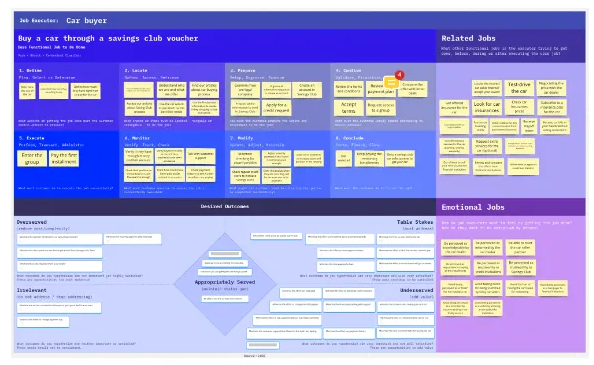
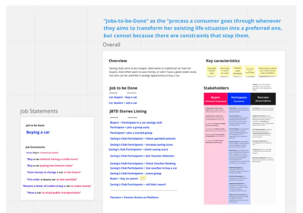
Conducting foundational user research, including Jobs To Be Done
Leading vision workshops and aligning on business outcomes
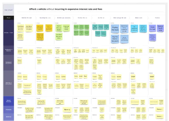
Mapping the end-to-end user journey
Ideating, wireframing, prototyping, and running usability tests
Designing and documenting the UI across platforms
Setting up post-launch measurement and iteration workflows
Discovery & Research
We kicked off with a deep discovery phase to understand our users and align stakeholders.
Highlights from Research:
Target: Ages 25–35 in Texas, looking to own a car.
Barriers: High inflation, lack of credit, confusing dealership processes.
Opportunities: Users were open to saving-based financing — if explained clearly.
Stakeholder Alignment
We kicked off the project with workshops to define the product vision, business goals, risks, and user hypotheses. These sessions helped align the team and define clear design objectives.
Understanding the User
Through qualitative interviews and JTBD analysis, we found that our target users felt anxious about credit scores, overwhelmed by dealership processes, and confused by hidden fees. They wanted transparency, flexibility, and control.
Opportunity Framing
We mapped out the desired user journey — from first exposure to full adoption — and identified trust-critical moments. This helped us define the MVP scope and prioritize features that directly addressed core user pain points while supporting lead generation and conversion.
Journey Mapping & UX Flows
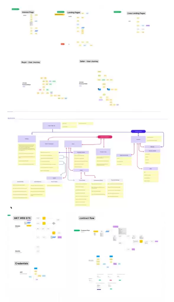
Mapping the User Journey
To better understand how customers discover and interact with the product, we created a customer journey map. This helped us identify improvement opportunities and challenges throughout the user’s experience — from first contact to long-term engagement.
We focused especially on the consideration and loyalty stages, which surfaced issues related to comprehension, trust, and clarity of next steps. This gave us a high-level view of the critical touchpoints where we could enhance the user experience.
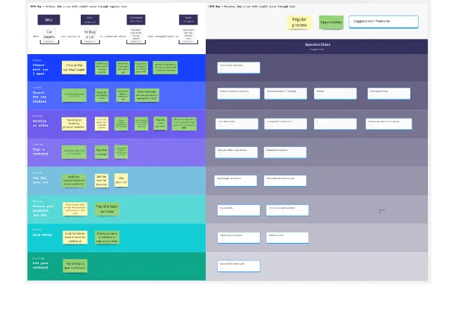
Designing the Flow
With a better understanding of the journey, I mapped detailed user flows — from the landing page through sign-up, onboarding, and app engagement. Particular attention was paid to moments of high drop-off, such as the financial simulation and signup forms.
This flow mapping gave structure to our design process, helping us define the information architecture and ensure every interaction felt logical and reassuring.
Sketching
Early Exploration
We started with low-fidelity wireframes to explore ideas quickly and cheaply. These focused on core flows like onboarding, product explanation, simulation, and application.
These early drafts helped:
Align stakeholders around the user journey
Validate key interaction models
Refine our value messaging before investing in visuals
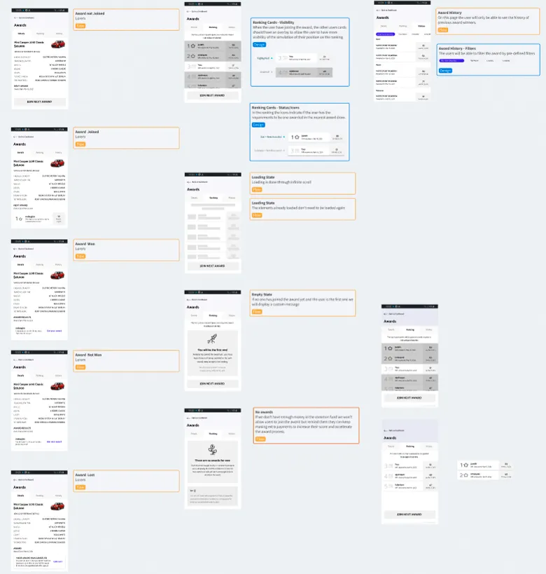
Prototyping & Testing
We built clickable prototypes to test comprehension of the financial model, usability of flows, and clarity of key messages. User feedback directly shaped copy, layout, and interaction patterns.
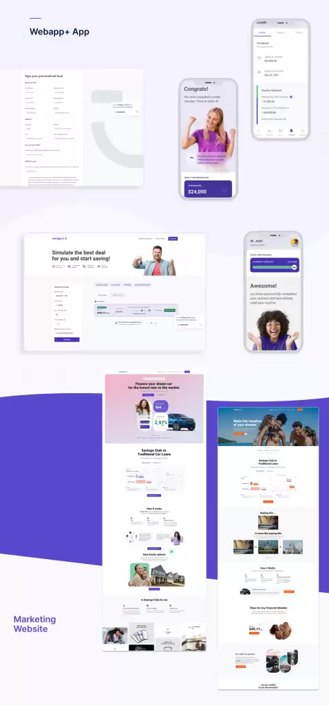
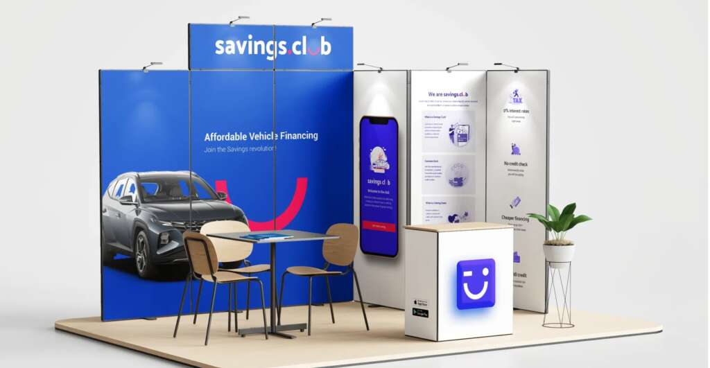
UI Design & Visual Language
Once we had validated the core experience and flows, we moved on to crafting the final visual design in Figma. Our goal was to build an interface that clearly reflected the brand’s promise: “Smart funding for smart people.”
We began with competitive analysis and visual benchmarks to understand how traditional banks and fintechs in the US communicated trust, clarity, and credibility. While our product introduced a completely new concept to the market, we deliberately leaned into familiar financial design patterns to create a sense of recognition and reliability from the very first impression.
To guide our interface design, we drew from systems like Material Design and NNS, adapting them to our context with a strong focus on clarity, accessibility, and consistency. We created a design system with well-defined tokens and components that allowed for scalable development and coherent branding across all touchpoints.
I designed assets for the responsive website, landing pages, and the mobile app, ensuring that the experience felt seamless, intentional, and trustworthy at every stage of the journey.
Post-Launch & Iteration
Analytics & Feedback
Once launched, we tracked key metrics like conversion rates, engagement, task completion, and bounce rates. We also collected qualitative feedback from users and support channels.
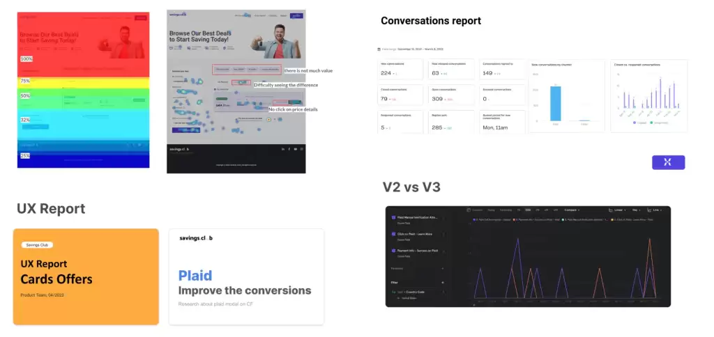
Continuous Improvement
We iterated quickly based on what we learned. For example, we noticed users dropping off at a certain form field, so we reworded the label and added contextual help — drop-off rates went down immediately.