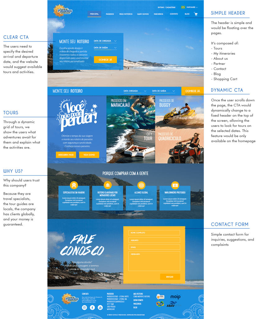
Strategy & Approach
Working closely with the client, I redefined the website strategy with a focus on clarity, usability, and emotional engagement:
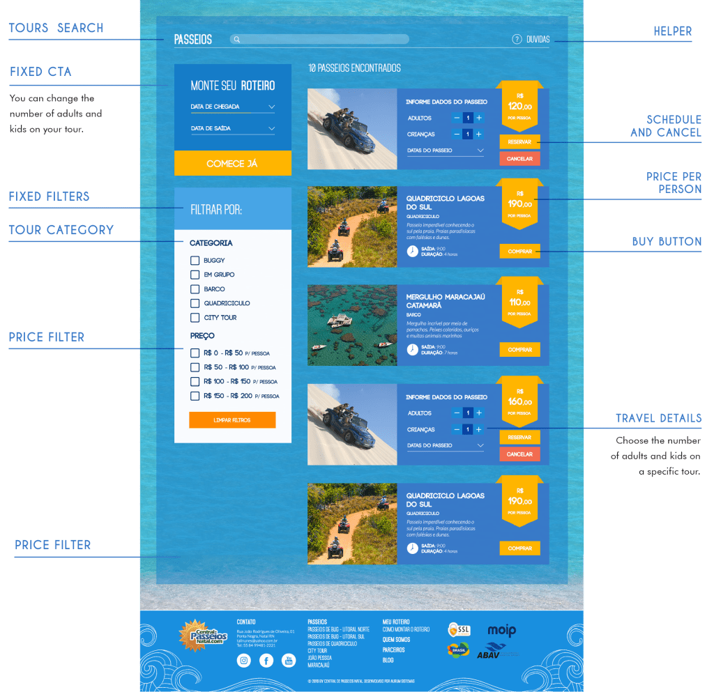
Information Architecture:
Reorganized the content to guide users intuitively through discovering tours, understanding pricing, and completing bookings.
Introduced filtering and categorization of tours (e.g., beaches, cultural, adventure).
Visual & Interaction Design:
Developed a modern, mobile-friendly design system inspired by Natal’s natural beauty.
Used large, vibrant images of the city to capture attention and build excitement.
Improved typography and color contrast for better readability and accessibility.
UX Enhancements:
Simplified the booking process into clear, digestible steps.
Added customer reviews and trust badges to increase credibility.
Ensured full responsiveness for mobile users, as many tourists book tours on the go.
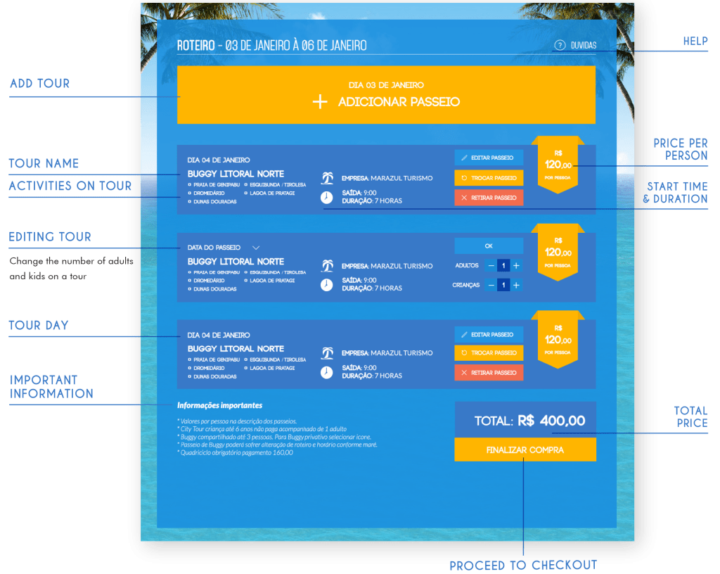
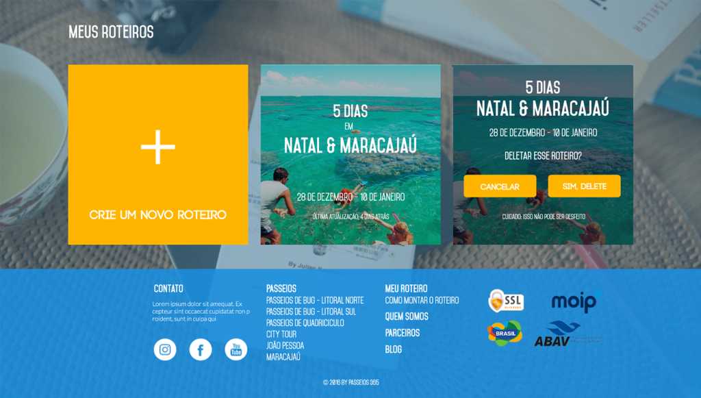
Another feature that I designed is the ability to build multiple itineraries, enabling agencies from other countries to create custom itineraries for their customers or use pre-defined templates to save time when planning trips.
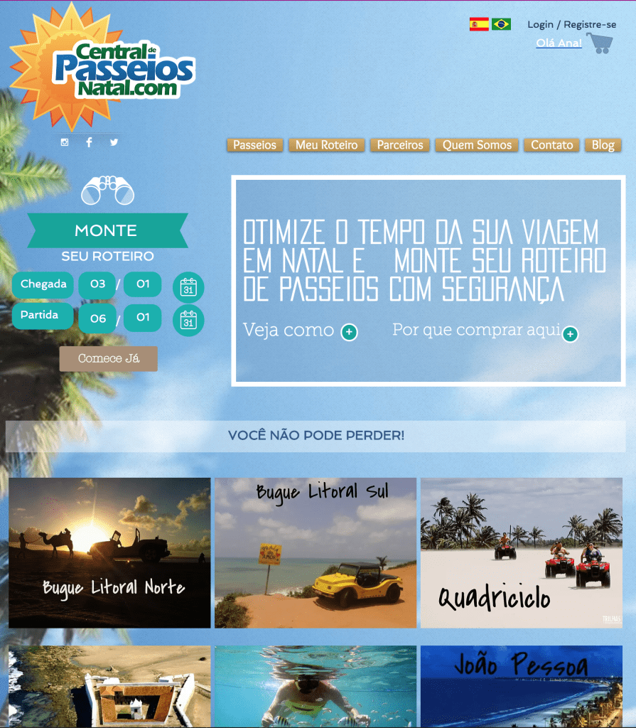
Old Website
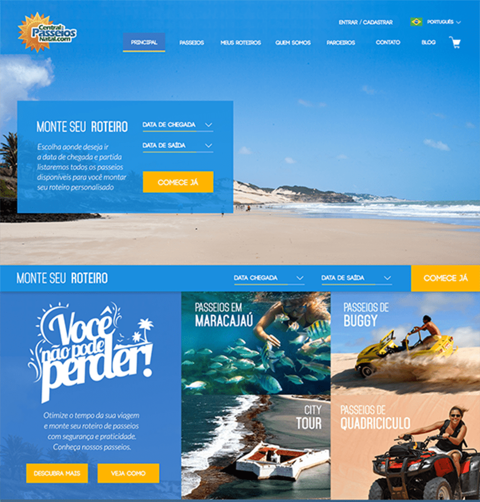
New Proposal
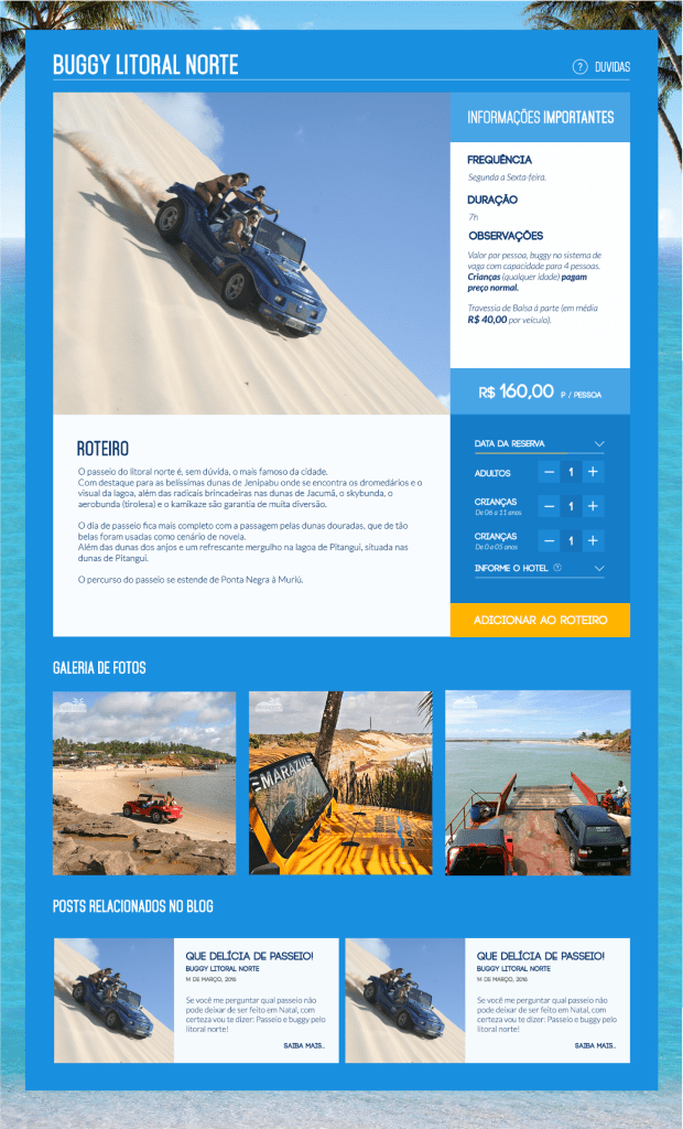
Previous Tour Details
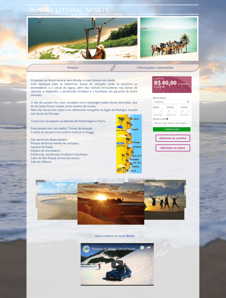
Redesigned Tour Details